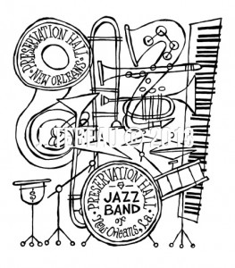
To hone my design skills I recently signed up for an online class (for a mere $20) via Skillshare. The assignment: make a poster for a music event. I chose the Preservation Hall Jazz Band’s (mostly) standing Wednesday night gig at the Hall in New Orleans.
Concept: As Preservation Hall had just celebrated its 50th anniversary, I wanted to commemorate that early-sixties cool jazz look so popular at the time.
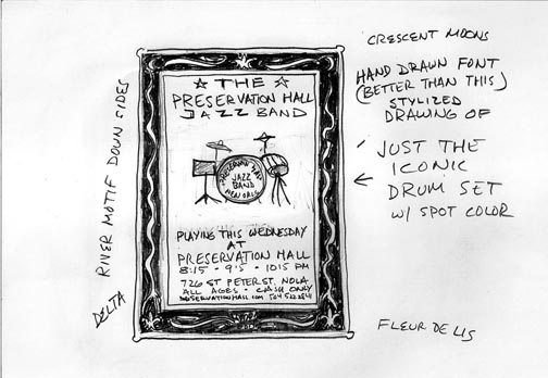
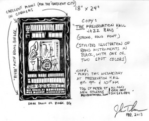
First I did a couple of sketches with explanatory notes and received online feedback from people in the class.
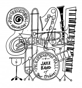
I leaned toward the second version and drew a draft of the instruments first; a jazzy jumble of stylized line-work:
Then I searched for “cool retro jazz posters” via Google images and found a few to inspire mood and font choice:
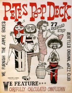
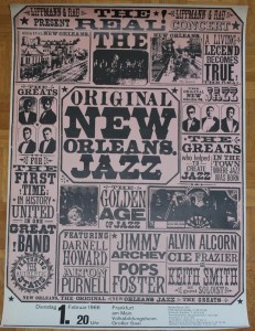
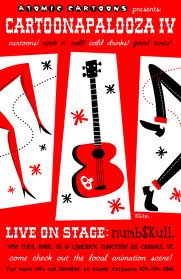
Then I found (via Google) an appropriately retro color palette. Jazzy but not overly cornball.
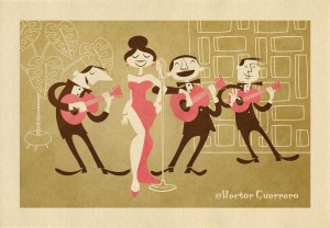
The first draft featured a larger border with a (poorly executed) river motif representing the Mississippi.
Sought and got feedback from people in the class, the teachers (Dan Kuhlken and Nathan Goldman of DKNG Studios in California), and friends (Jeff H. and Jeff S.) and The Wife. Made changes to drawing.
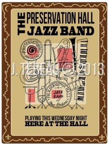
I then redesigned the poster with new art, final fonts, and a cool patina of old funk via a texture layer, free from the good people at Digital Yard Sale.
Voilá!
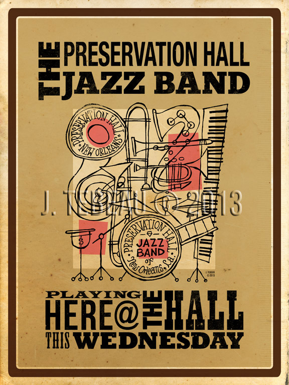
John Tebeau © 2013

